Ridership Determinants in Delaware Valley
Introduction
As equity and sustainability concerns catch planners’ attention especially since Present Donald Trump came into power, public transportation, especially rail transit service, provides this context for addressing accessibility for people for all income levels and reducing GHG emissions through decreased use of automobiles. Otherwise, transit network is historically associated with land development. Current transit-oriented developments (TOD), appearing in plan documents commonly, tries to site housing, workplaces and other urban activities within easy walk to rail stations, creating more ridership for rail transit services. In the Delaware Valley Region context, Delaware Valley Region Planning Commission (DVRPC) highlights the potential benefits of an improved transit network in the coming decades, illustrated in its Long-Range Vision for Transit. The report also puts forward operational improvements and investment recommendations for rail transit service providers within the region, including Southeastern Pennsylvania Transportation Authority (SEPTA), New Jersey Transit and Port Authority Transit Corporation (PATCO).
Direct models using regression are especially appropriate for investigating possible explanations for ridership at station level for each transit lines to further guide the capital investment and rail transit construction and improvement projects. Besides the ridership forecast models, we additionally develop logit model for predicting the probability of people using rail transit services as a supplementary. Moreover, by identifying factors affecting ridership, transportation planners could more easily conduct cost-benefit analysis to evaluate future programs and more broadly, collaborate with developers, municipal government, and other stakeholders to figure out strategies for transit-oriented developments.
DVRPC and Rail Transit Service
Delaware Valley Region includes nine counties through Pennsylvania and New Jersey, shown in Figure 1. DVRPC, as the federally designated Metropolitan Planning Organization for the Greater Philadelphia Region, dedicates to improving transportation and other integrated system in the region. According to its dataset1, there are 326 rail transit stations included in 29 lines in DVRPC with services provided by SEPTA, NJ Transit, PATCO and Amtrak, among which SEPTA owns 276, accounting for 83 percent of the stations, as shown below. Besides, over 100 stations serve Philadelphia County, the largest city in the Delaware Valley Region, having considerable economic activity within the area, which highlights considerable need for public transit services targeted at daily commuters. Commuter rail service constitutes the largest part with 164 stations, and the rest include intercity passenger rail, light rail, rapid transit, subway and surface trolley.
Data Source and Methodology
Method Overview
In order to explain and predict ridership, we use multivariate regression to estimate the quantitative relationship between explanatory variable and station level ridership. The explanatory variables are selected first according to theory and data availability and then by correlation with the dependent variable and among each other to get the smallest but fullest set of explanatory variables to choose from, avoiding multicollinearity. The inclusion of dummy variables is based on the result of t-test for the significant difference between two groups’ ridership mean or on the result of f-test (Crosstable) for the significant influence of one categorical variable on ridership. Only categorical variables that pass the hypothesis tests are included in the original model. To build model, this project used backward elimination first, which excludes variables that statistically insignificant deteriorate the model fit and stops when no further variables can be deleted without a statistically significant loss of fit. Then, providing the system error of this stepwise method, which includes variables that only significant under the condition of the existence of other variables are not excluded, this project run anova test comparing with or without marginal significant variable to decide whether or not to exclude the variable.
Secondly, since the ridership and some other characteristic of each station varies a lot and might have different quantitative relationships, this project also run Cluster analysis to group similar stations and fitted multivariate regression respectively to each cluster so that the final model could be more detailed in terms of explanation and more accurate in terms of prediction. We chose only standardized ridership (dependent variable) and the most important independent variable according to the original multivariate regression as the clustering characteristics of each station to get an easy clustering for followed comparison between regression models. Also by using these two variables, some other hided explanatory variables are more likely to be revealed without the overwhelming influence of the most important variables. To find the optimal number of clusters we use both Elbow Method in K-Means Clustering and Cluster Dendrogram in Hierarchical Clustering to study the Euclidean distance between observations. The final clustering is generated based on the two diagrams and also with the consideration of capability to fit multivariate regression for each cluster.
At last, since the previous multivariate regressions only analyzed cross-section data, mainly the difference across stations, we introduced binominal regression to monitor the potential changes in stations with time, basically to estimate the future change of stations’ ridership, based on the current characteristics. This project introduced a dummy variable “decrease” which is 1 only when the 2013 ridership is lower than the 2008 ridership. The explanatory variables are the same as those used in previous multivariate regression. This project did not use the changes of explanatory variables which are obviously more associated with changes in ridership, instead it applied only absolute value, in order to achieve a more universally applicable model. This is in part because changes of the explanatory variables require time series data of all variable, and limit the model application when any one of the precedents is inapplicable.
Data Source and Preparation
For the station-level ridership determinants, we use station as unit of analysis, and choose average weekday onboarding as the dependent variable. The ridership data is obtained from DVRPC, Analytical Data Report, 2008. To match the service area characteristics and station characteristics to the onboarding data by each station, we create a 1/2-mile radius around rail transit stops as a transit zone for every station, as shown in Figure 2, illustrated by orange circle.
Table 1 summarizes all the independent variables that we will include in regression model. They are categorized by two groups. One is service area attributes, including demographic data (total population, households, households per acre, age, income, race, worker, and car ownership) influencing travel demand and mode choices, land use data (property value, concentration of residential and commercial land use, in addition to connectivity class) which will mostly affect the trip generation. Particularly, demographic data comes from DVRPC, Analytical Data Report, 2008, which is the same as the source of average weekday onboarding data. The variable age is divided by additional 6 groups, median household age, percentage of household age of 15 to 24, 25 to 34, 35 to 54, 55 to 64, and over 65. To process original household income data which is divided by 4 income classes using percentage value, we calculate the expected income for each transit zone by multiplying median income for each group by percentage number of households in this group.
For the property value in Delaware Valley Region, we use web crawling tool to collect data from trulia.com with all the location data for each property. Then we display property data in ArcGIS and use inverse distance weighted (IDW) interpolation combined with the tool of extract value to point to get the price of property for each station. IDW assumes that each measured points (property value of each location) has a local influence that diminishes with distance, which means it weights the points closer to the prediction location greater than those farther away. Particularly, when we use this approach, we specify the search radius as 0.5 mile to get the prediction value of the entire surface. The result after using IDW is illustrated in Figure 3 and the result of property value for each station is shown in Figure 4 after extracting value to point. They altogether show that the property value around the station in Philadelphia Center City and rail lines passing through Philadelphia, Delaware County and Chester County is higher than other areas.
We get data of transit connectivity score from DVRPC Open Data website, reflecting the connectivity of a place’s street network measured by intersections, as a representative of walkability that will impact decision makers’ choice to take rail transit. The shapefile of transit connectivity score is of DVRPC traffic analysis zone. So, we input it into ArcGIS and use spatial join to get the connectivity score for each station, which is classified by 5 classes from low to high, shown in Figure 5.
Furthermore, we use number of land use type, share of commercial areas and share of residential areas within the transit zone as another three explanatory variables to represent mixed land use which supports transit services, and travel demand which generated largely by residential and commercial land use as both origin and destination. These three explanatory variables are acquired based on the land use shapefile released by DVRPC. Number of land use type are generated by “one to many” spatial joining land use to transit zone and then cleaned duplicated type in R. Share of commercial and residential areas are generated by “one to one” spatial joining exported commercial and residential shapefile to the transit zone with sum area merge rules.
The other group of independent variables is station attributes, comprising the county variable that the station is located, the type of transit service the stop is associated, and the dummy variable whether the station is in Philadelphia. Particularly, for the transit service, we reclassify the service type by commuter rail, rapid transit, subway and surface trolley.
Multivariate Linear Regression Model
Selection of Variable
The dependent variable, average weekday on boarding, is plotted by histogram (Figure 7) showing its distribution. Instead, when we use log transformation for this variable, its distribution is much closer to standard distribution (shown in Figure 7), which is better for developing regression model. Also, we use log transformation for all the continuous independent variables to make their distribution much closer to standard distribution to run linear regression model.
To rule out some independent variables which are highly correlated, we use correlation test for all the continuous variables and the results are demonstrated in Figure 8. The test reveals that the correlation between log transformation of percentage of number of households between age 15 to 35 and log transformation of ridership is contrast to the correlation between log transformation of percentage of number of households over 35 years old and log transformation of ridership, shown in Figure 9. Therefore, we further process the age data by dividing the age group over and below age 35. Another finding is that total population for each transit zone, the number of households and household density are highly associated. So, we choose the variable of household density since it is relatively highly correlated with log transformation of average weekday onboarding according to the correlation coefficient 0.56, compared with total population (0.42), and number of households (0.48). Particularly, Figure 10 shows the relationship between log transformation of ridership and some independent variables with comparably higher correlation coefficients.
For categorical variables, we use t-test and f-test to determine whether it could be put into regression model. Firstly, the boxplot (Figure 11) illustrates the relationship between log transformation of ridership and stations’ location by county, which indicates the mean of log transformation of ridership for each county and the range of it are totally different. Besides, we change the reference category for county and specify Philadelphia as base line when constructing linear regression model. Moreover, we also use density plot to examine the relationship between dependent variable and type of transit service, shown in Figure 12. Meanwhile, we divide the log transformation of onboarding into four classes according to its quantile, and run cross table function between ridership and type of service. The f-test result, chi-square of 233.33, combined with extremely low p-value indicates the significant difference between log transformation by transit service type. Finally, for the dummy variable whether the station is in Philadelphia, we use boxplot (Figure 13) and t-test to examine the difference between the two groups. The result reveals that the mean of log transformation of ridership for station in Philadelphia is nearly 7, and for the other is -0.357, and p-value is greatly less than 0.01. Therefore, all the variables classified to station characteristic should be included in regression model.
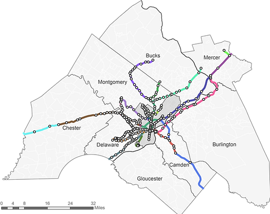
Figure 1 Map of Delaware Valley Region, Rail Transit Stations and Transit Lines
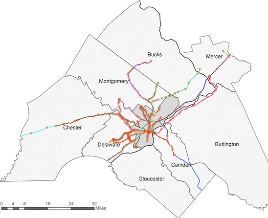
Figure 2 Map of station and its transit zone
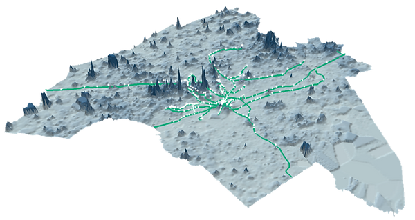
Figure 3 Map of property value in DVRPC
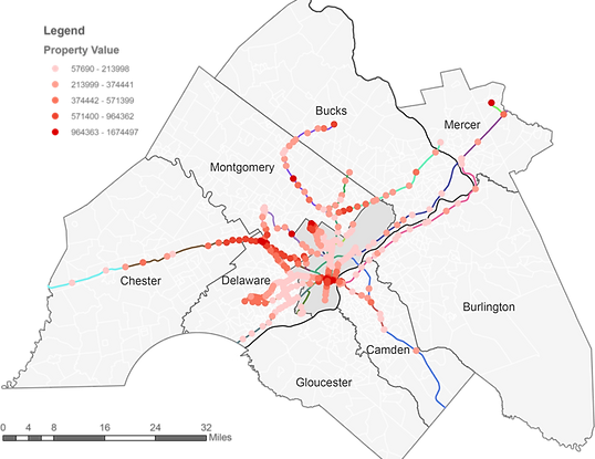
Figure 4 Map of property value for each station in DVRPC
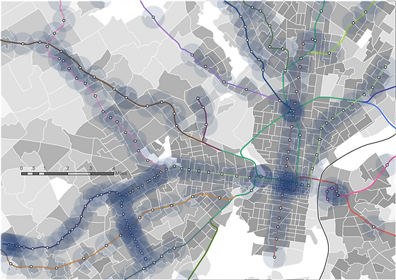
Figure 5 Map of connectivity score of TAZ overlaid with transit station, zoomed in Philadelphia and surroundings
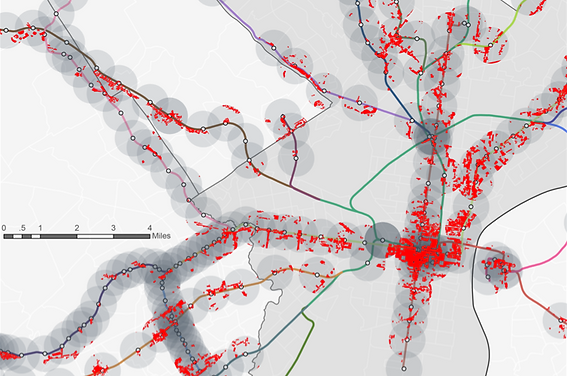
Figure 6 Map of commercial land use in each transit zone, zoomed in Philadelphia and surroundings
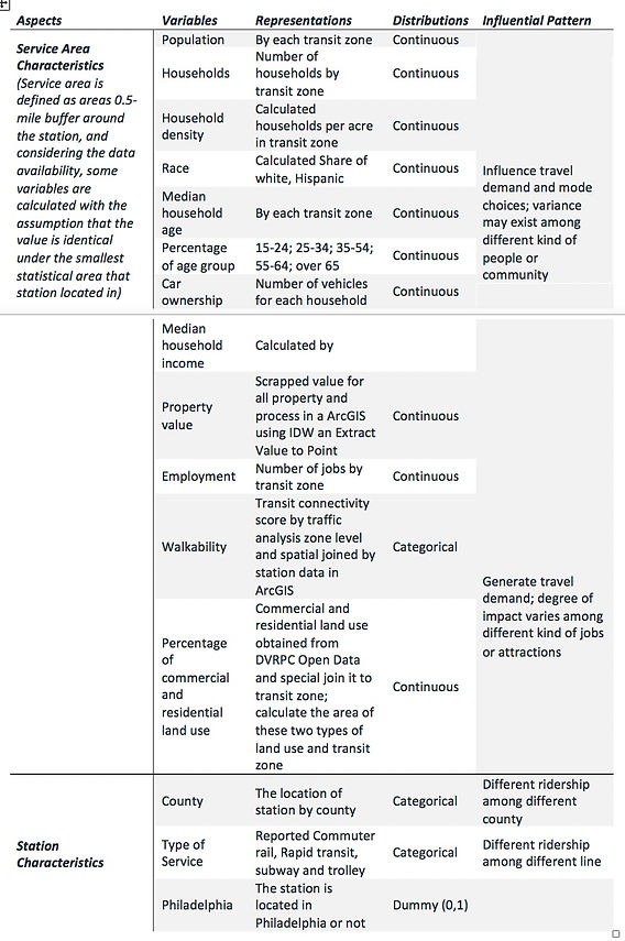
Table 1 Explanatory variables, distributions and influential pattern
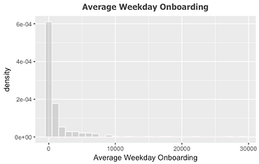

Figure 7 Distribution of average weekday onboarding and log transformation of it
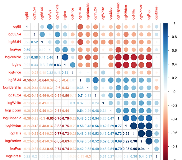
Figure 8 Results of Correlation test for all the input variables
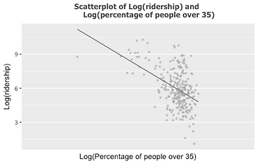
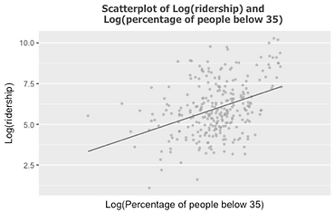
Figure 9 Results of Correlation test for all the input variables
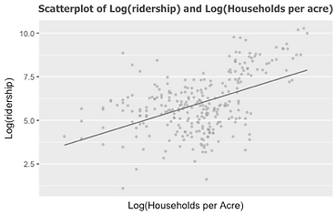
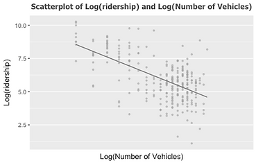
Figure 10 Results of Bivariate Regressions
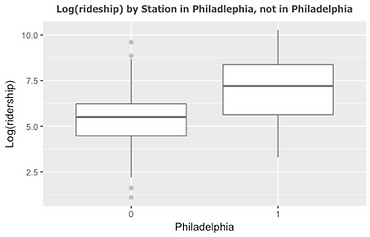
Figure 13 Boxplot of ridership by in Philadelphia or not
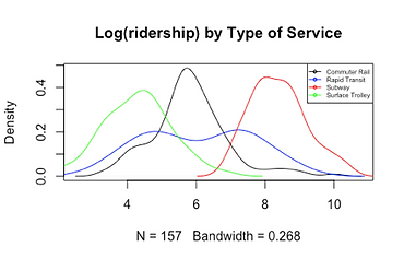
Figure 12 Density plot of ridership by service
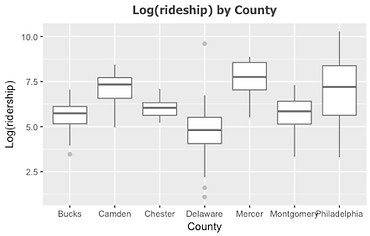
Figure 11 Boxplot of ridership by county
Model Building
With all the twelve continuous variables and four categorical or dummy variables, we construct linear regression model for average weekday onboarding. To get the final best “lean & mean” model, we use automatically stepwise selection for both directions in addition to manual backward selection to drop variables one by one. The criteria for dropping variable is that remove the variable with the highest p-value first and AIC will be lower after dropping. Table 2 shows the steps of dropping each variable, as well as the signs of dropping. The model after dropping variables has AIC of -23.27, decreasing from AIC of initial model, -10.03 and additional dropping will have higher AIC. Especially, this model has the variables with p-value less than 0.01 except for share of residential land use. To determine whether it will be included in final model, we run anova test between the model with/without this variable. The test result reveals that it could be exclude according to decreasing residuals.
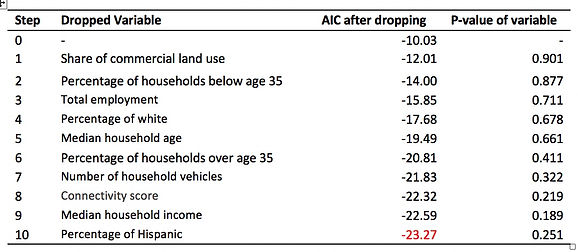
Table 2 Steps of dropping variables
Result and Interpretation
Table 3 demonstrates all the variables in the final best model, estimated coefficients, and p-value for each of them. Adjusted R-Squared for this model is 0.675 and p-value is lower than 0.001(especially for the variables with yellow fill color), indicating the it can explain the 67.5% variation of log transformation of average weekday onboarding for each station in Delaware Valley Region with high level of significance. Besides, VIF value for each variable is less than 4, quite low to ensure that the model avoids multicollinearity, or the explanatory variables are not correlated with each other.
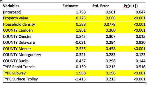
Table 3 Results of multivariate regression models with backward selection
Otherwise, we use standardized variables to run regression model after log transformation for every variable. We find that household density has the highest estimated coefficient, illustrating its strong power affect the dependent variable. For household density, one percent increase in households per acre is associated with 0.588% percent increase in average weekday onboarding, controlling for other variables. Besides, there is significantly positive relationship between property value and ridership by station, holding other variables constant. Otherwise, stations in Camden and Mercer have more average weekday onboarding than stations in Philadelphia, if other variables don’t change. Furthermore, stations of subway have nearly 7 additional ridership compared to stations in commuter rails, controlling for other variables.
Model Fit
We use the original 2008 characteristics as explanatory variables input and generated estimated ridership based on the model. The estimated value and the observed value are plotted as below.
As shown in the density plot, despite the fact that this model has a good explanatory power, the prediction accuracy varies across stations, specifically, stations with an average weekday boarding of around 400 (log(ridership)=6) are predicted with ridership far higher than the real value. This indicates that the ridership and explanatory variables may have different quantitative relationship among different stations.
Improved Multivariate Linear Regression Model
Cluster Analysis
In order to fix the poor prediction and to introduce more explanatory variables in the final model, this project introduced cluster analysis to group similar stations and fit multivariate regressions respectively. Ridership and household per acre are selected as stations’ characteristics. The reasons are as follows. On the one hand, according to the previous model fit, the quantitative relationship varies among different ridership. On the other hand, diminishing the impact of the most important explanatory variable, household per acre, may reveal the influence of other variables that lead to the different quantitative relationship between ridership and explanatory variables.
After standardizing these two variables, we use K-Means clustering to find the optimal cluster numbers. The result is shown as below.
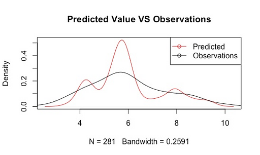
Figure 14 Density Plot of Estimated and Observed Ridership

Figure 15 Within Groups Sum of Squares Changes with Number of Clusters
According to the Figure above, the difference within group decrease sharply after grouped into to clusters and does not decrease too much after grouped into more than three groups. This indicates that the optimal number of cluster is ideally 3 or 2.
To justify the number of cluster, this project used Hierarchical Clustering to directly visualize the grouping of observations, shown in the figure below.

Figure 16 Cluster Dendrogram of Hierarchical Clustering
As shown in the dendrogram above, the distance between two clusters is noticeably far when clustered into two groups. Although there is an obvious three-cluster grouping at the height of 1.8 or so, the distance between the right two clusters are comparatively short. Also, considering the fact that there are no more than 300 available stations within the Delaware region, and they cannot fit multiple regressions when clustered into too many groups. Therefore, this project chose two as the ideal number of clusters.
To simplify the analysis, this project use K-Means to group stations into two clusters. The distribution of stations and the centroid of the clusters are shown as follows.
According to Figure 17 the density of two clusters are similar and both of them are not non-convex or non-round shaped, all of which justify the usage of K-Means clustering, avoiding its system error of grouping observations to the nearest mean.
Furthermore, based on the centroid as well as the scatterplot, most of the stations fall into the first cluster with medium ridership and medium household per acre. And there are some stations with extremely high ridership and household density grouped as the second cluster.
Hybrid Multivariate Regressions
After that, this project used the same explanatory variables and the same building process to fit multivariate regression model for the two clusters respectively. The variables and corresponding coefficients are shown in the table below.
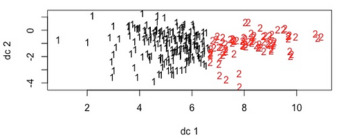

Figure 17 K-Means Clustering Results

Table 4 Centroid of Clusters
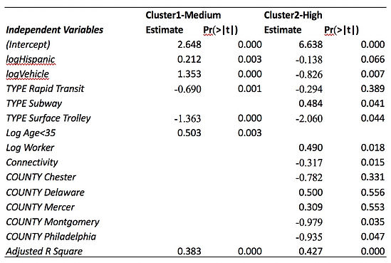
Table 5 Results of Multivariate Regression Models for Two Clusters
According to the table, for the majority of the stations:
Ridership = 2.648 + 0.212 * log (Hispanic Population) + 1.353 * log (Average Household Vehicles) – 0.690 * Rapid Transit – 1.363 * Surface Trolley + 0.503 log (age from 15 to 35)
The adjusted R square of this model is 0.383, which is significant under the 0.000 confidence interval, suggesting an overall good fit. And the VIF of all the variables are less than 2, suggesting little chance of multicollinearity. As revealed in the estimated coefficients, a 1 percent increase in Hispanic population is associated with a 0.212 percent increase in ridership after controlling other factors. A one percent increase in average household vehicles is associated with a 1.353 percent increase in ridership when other factors are controlled. Also, a one percent increase in population aged from 15 to 35 is associated with a 0.503 percent increase in ridership. Moreover, stations with just median ridership do not have subway service. Compared with Commuter Rail, Rapid Transit on average reported approximately 2 (e^0.690) less ridership, controlling for other factors. At last, compared with Commuter Rail, Surface Trolley on average reported approximately 4 (e^1.363) less ridership, controlling for other factors. In a word, the ridership is higher when service areas have a larger disadvantaged population, including Hispanic population, young population, and no car household, all of which are more likely to take transit for their own constraints. Also, Subway and Commuter Rails are more popular for travelers when compared with Trolley and Rapid Transit.
On the other hand, for stations with extremely high ridership and household density:
Ridership = 6.638 – 0.138 * log (Hispanic Population) – 0.826 * log (Average Household Vehicles) -0.294 * Rapid Transit + 0.484 * Subway -2.060 * Surface Trolley +0.490 * log (Number of Worker) – 0.317* Connectivity – 0.782* Chester + 0.500 * Delaware + 0.309 * Mercer – 0.979 * Montgomery – 0.935 * Philadelphia
The adjusted R square of this model is 0.427, which is significant under the 0.000 confidence interval, suggesting an overall good fit. And the VIF of all the variables are less than 10, suggesting little chance of multicollinearity. According to the estimated coefficients, a 1 percent increase in Hispanic population is associated with a 0.138 percent decrease in ridership after controlling other factors. A one percent increase in average household vehicles is associated with a 0.826 percent decrease in ridership when other factors are controlled. Also, a one percent increase in number of workers is associated with a 0.490 percent increase in ridership. A one percent increase in connectivity is associated with a 0.317 percent decrease in ridership. Moreover, compared with Commuter Rail, Rapid Transit on average reported approximately 1.34 (e^0.294) less ridership, controlling for other factors. Compared with Commuter Rail, Surface Trolley on average reported approximately 7.85 (e^2.060) less ridership, controlling for other factors. At last, compared with Commuter Rail, Subway on average reported approximately 1.62 (e^0.484) more ridership, controlling for other factors.
In a word, for those extremely busy stations, ridership started to be positively associated with number of workers and the provision of Subway service. Both of them indicate that high ridership is associated with commuting by rail. Hispanic population has reversed impact on high ridership stations. According to the previous correlation analysis, this is in part because that Hispanic Population is negatively correlated with the prominent positive determinant household per acre. Ridership is positively associated with household per acre, and Hispanic Population is negatively correlated with household per acre. Therefore, Hispanic Population might be negatively impacting ridership when diminishes the influence of household per acre. In terms of the connectivity score, it is originally added as a measure of walkability which might encourage choosing transit service. However, the regression analysis revealed the opposite impact. This is because the connectivity is measured by number of intersections which is also associated with the efficiency of road network. Basically dense road network is not only welcoming for walking but also promote efficient auto travel with probably less congestion. In all, high connectivity score here is more influential in terms of inducing auto travel and walking instead of improving the accessibility of transit station.

Figure 18 Density Plot of Two Estimated and Observed Ridership
Compare the estimated value of hybrid regression model with the previous model as well as the observations. According to the figure above, the new model has a more accurate prediction result while the ridership is around 55 (e^4) to 400 (e^6). We also calculated the distance between estimated value and reported ridership. The sum of the distance decreased from 238 to 163 from original model to the new hybrid model. Both the graphics and distance suggest that by clustering stations, model improves.
Binomial Logistic Regression Model
Input Variables and Model Building Process
To predict the future changes in ridership we created a dummy variable that indicates the changes from 2008 to 2013. It is 1 only when the 2013 ridership is lower than that of 2008. The independent variables are the same as those in the previous section, and the only difference is that for binominal logistic regression this project take the original variables instead of log transformed ones for easier interpretation. This project used forward selection to add variables into the model and check the significant level of all added variables and eliminated the insignificant ones if applicable after every addition, in order to avoid the drawbacks of forward selection which may include insignificant explanatory variables under the existence of new added ones. Table 6 shows the steps of adding each variable, as well as the signs of adding. The model after adding variables has AIC of 181.69, decreasing from AIC of initial model, 220.93 and additional adding does not decrease AIC significantly.

Table 6 Steps of adding variables
Result and Interpretation
The final Binomial Logistic Regression Model is shown in Table 7 with most of the coefficients significant under 0.05 confidence interval, except for some categories in the categorical variables.
In terms of overall model fit, the model has a relative small AIC (a measure of the relative quality of statistical models), which is 181.69, and the McFadden R square is 0.234, which is a good fit under 275 degree of freedom. Compare the chisquare test for deviance of Null model and the final model. Although both of them pass the cruit value for their degree of freedom, the final model is obviously better. (final model: 169.69<<314.68; Null model: 218.93<320.03)
The receiver operating characteristic curve of White Population Alone also suggests that this model is good fit. The classification accuracy is higher than random distribution (The grey line).
Based on the model, we also estimate whether a station’s ridership will decrease or not by setting the proportion of decreased station in 2013 as the threshold to generate the fitted change type. Specifically, if the fitted possibility is greater than 0.1317, it will be classified as ridership declined. Comparing the fitted classification with the actual value, 170 out of 281 samples are classified right. The classification accuracy is 60%. This suggests a moderate model fit too.
For all these variables, according to statistical test, their importance is as follow (Table 8). The most important variable is Service Type as a whole, then Vehicle per household and at last White Population Alone.
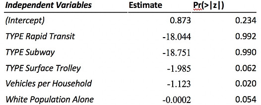
Table 7 Coefficients of Binomial Logistic Regression Model
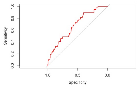
Figure 19 ROC Plot of White population
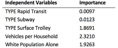
Table 8 Variable Importance
In all, whether a station’s ridership will decrease or not from 2008 to 2013 can be explained be its Type of Services, Average Vehicles per Household and White Population of its service area, namely the ½ mile transit analysis zone.
For a more detailed quantitative explanation of the impacts of variables to dependent variable, we exponential the estimated coefficient for every variable, minus by 1 and covert to percentage to explain the impact using odds ratio, which is defined as the proportionate change in odds of change to urban use given that the certain condition of independent variable. The odds ratio is calculated by exponential the estimated coefficient. The application of odds ratio is because that the logistic regression is a transformed linear regression, the coefficient of which cannot be interpreted directly. Besides the same direction of the lower and upper bond suggest that the impact does not vary because of error to a degree that the direction of impact reversed.

Table 9 Explanation of Impact
Since the coefficients of rapid transit and subway are not significant, the impact directions vary within the confidence interval, suggesting inaccurate estimation of these two. For others variables the impact directions are more likely to be consistent. Therefore, according to Table 9, the odds of stations providing surface trolley service witness ridership decline is 86.27% lower than stations without subway service. For each additional vehicle in the service area households on average, a station’s odds of ridership decline decreases by 67.47%. For each additional White people in the served transit analysis zone, a station’s odds of ridership decline decreases by 0.02%.
Frankly speaking, provision of surface trolley, high average vehicle per household and large white population are less likely to witness ridership decline. This is in part because that surface trolley already has the lowest ridership (Figure 12), and riders of which are more constant and less likely to shift. Similarly, stations serving an auto-oriented with large number of White people have comparatively constant share of transit users, whose choices of mode are more associated with personal preference. However, non-White people with no or few vehicles in households are more likely to choose transit service due to external constraints, for example low income, instead of personal preference. Therefore, they are more subjective to changes when the external constraints no longer exits. Specifically, they might shift from rail to car after income increase. Thus, stations serving a neighborhood with low car ownership and large number of White population have high possibility to witness ridership decline in the future.
A more direct visualization of the quantitative relationship is shown in the figure below.
According to Figure 20, the possibility of ridership decrease declines with the increase of white population. Then comparing the green ones with blue ones, it suggests that stations serving a neighborhood with more average household vehicles have lower probabilities of ridership decline. At last, the yellow ones under the green ones suggest that stations with surface trolley service are less likely to decline compared with those with commuter rail service.
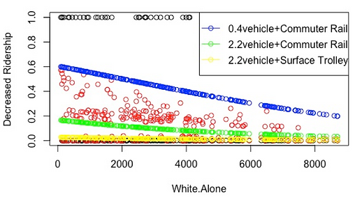
Figure 20 Predicted possibility of ridership decrease
Conclusion
Based on the analysis, this project revealed that in Delaware Valley subway is the most popular type of rail service, and then commuter rails. The least popular service is surface trolley. Ridership differs across the County too.
In terms of the service areas, the determinants of ridership include household density and property value, both of which are positively associated with high ridership. This is in part because people and economic or daily activities generate travel demand.
However, after grouping stations into two clusters based ridership and most important determinant household density, some other determinants revealed too. For the majority of the medium performance station, ridership is positively associated with the size of disadvantaged population, which includes younger population, Hispanic population and households with no or few vehicles. On the other hand, the extremely busy stations are more positively associated with number of workers and negatively associated with road network connectivity. In other words, the majority of the transit users are the result of external constraints. Those who have to use rail contribute to the most of the ridership. However, an extremely high ridership is more likely to be the result of active economic activity including commuting and also the severe inconvenience of other mode, specifically driving and walking.
At last, ridership in stations with surface trolley are less likely to decline in the future. Besides, stations serving a neighborhood with large size of non-White population and few vehicles per household are more likely to witness ridership decrease. This is because that the choice of rail service in these area is more the result of external constraints instead of personal preference, which is more subjective to shift when the external barrier no longer exist, namely these areas have larger capacities to change.
Although this project is generally satisfying in terms of both explanatory and prediction as demonstrated above. Some improvements could be made too. First of all, in order to avoid multicollinearity, this project use stepwise method to add or drop variables. However, some variables, though correlated with other more significant variables still has its own influence in terms of theory, they should not be excluded from the model completely which may result in few explanatory variables. This problem exists especially in the binominal logistic regression when only two variables are included with acceptable confidence level. The introduction of Principal Components Analysis might help address this problem. It might be useful to run principal components analysis first to convert all the variables into a set of linearly uncorrelated and theoretical meaningful variables, namely principal components. These components are the linear function of all the explanatory variables. Taking the first several components that consist more than 85% of the information of all the explanatory variables and run stepwise multivariate regression and binominal logistic regression by inputting these components as new explanatory variables. The final regression model will be more theoretical meaningful.
We tried principal component regression analysis for the binominal regression, but the model fit does not improve significantly[1]. This suggests that some other explanatory variables are not included and thus degrade the model fit. For explanatory variables, we could take more disadvantaged groups, such as people in poverty, female head of household with child, which can also highlight equity concern. Otherwise, this study only considers commercial and residential land use in each station’s surrounding areas as a factor influence trip generation. More accurately, additional variables, including employment by different type (retail, education, health and care, etc.) could be regarded as variables representing the concentration of activities that will lead to more trips. Also the fare of ride as well as the speed and cost other alternatives in that service area could be added too.
[1] See Appendix
Appendix
Principal Component Analysis

Figure 21 Variances in Components

Table 10 Determine optimal number of components
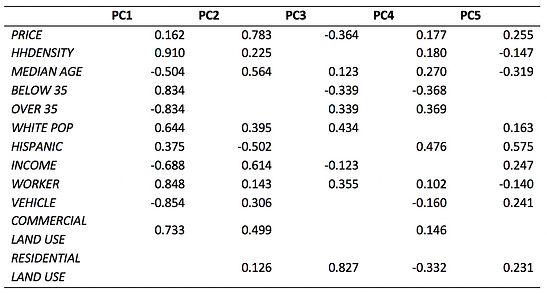
Table 11 Functions of Components
Note: AIC =183.41, pR2= 0.21
Model fit does not improve significantly compared with the original one.

Table 12 Principle Components Regression Analysis